
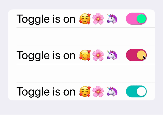
How to Customize Switch Toggles in SwiftUI with TCA
I will guide you through the process of customizing the colors for both the “on” and “off” states of a Toggle.

According to Apple, a Toggle is a user interface control that allows users to switch between the “on” and “off” states.
Furthermore, a Toggle can be customized using a ToggleStyle, which can encompass a wide range of design elements and components, in line with the preceding definition.
In the realm of Frontend Development, the Toggle with the Switch Style stands out as a highly favored choice. In this article, I will guide you through the process of customizing the colors for both the “on” and “off” states of a Toggle, similar to what you saw in the demo above, all within the context of SwiftUI.
To further explore this topic, you can find the link to the demo of the project below.
Problem
SwiftUI lacks a straightforward way to implement custom colors for the “off” state of a Toggle Switch.
Solution
Create a Custom Toggle Style.
You essentially need to create a new ToggleStyle and create some of the components again.
ColoredSwitchToggleStyle.swift
public struct ColoredSwitchToggleStyle: ToggleStyle {
    let colorModel: ColorSwitchModel

    public init(colorModel: ColorSwitchModel) {
        self.colorModel = colorModel
    }

    public func makeBody(configuration: Self.Configuration) -> some View {
        HStack {
            configuration.label  // The text (or view) portion of the Toggle
            Spacer()
            RoundedRectangle(cornerRadius: .cornerRadius, style: .circular)
                .fill(configuration.isOn ? colorModel.onColor : colorModel.offColor)
                .frame(width: .toggleWidth, height: .toggleHeight)
                .overlay(
                    Circle()
                        .fill(colorModel.thumbColor)
                        .shadow(radius: 1, x: 0, y: 1)
                        .padding(1)
                        .frame(width: .thumbDiameter, height: .thumbDiameter)
                        .offset(x: configuration.isOn ? .thumbDiameter / 2 : -.thumbDiameter / 2)
                )
                .animation(Animation.easeInOut(duration: 0.2))
                .onTapGesture { configuration.isOn.toggle() }
        }
        .font(.title)
    }
}
I created a ColorSwitchModel to simplify the way we separate the colors we use here.
ColorSwitchModel.swift
public struct ColorSwitchModel: Equatable {
    let onColor, offColor, thumbColor: Color
}
How to use the ColoredSwitchColor
....
Toggle(
    isOn: viewStore.binding(
        get: \.isToggleOn,
        send: .view(.toggleSwitchTapped)
    )) {
        Text(viewStore.text)
    }
    .toggleStyle(
        ColoredSwitchToggleStyle(colorModel: colorModel)
    )
...
You essentially call your new ColoredSwitchToggleStyle through toggleStyle .
Integrate TCA
Now, let’s delve into the exciting part — integrating TCA into this view.
Requirements
- Synchronize Toggle and State: Ensure that the toggle value directly reflects the state’s value. In other words, when the state changes, the toggle should immediately respond accordingly.
- Interactive State Change: When you tap on the toggle, it should trigger a change in the state, causing some observable alteration — for example, modifying the displayed text.
Reducer
To achieve this seamless integration, follow these steps within the reducer:
- State-Toggle Binding: Establish a binding between the state’s value and the toggle you’ve just created. This linkage ensures that the two stay in sync. Any change in one is accurately reflected in the other.
- Update the Reducer: In the reducer, incorporate the logic required for handling the toggle’s state changes and their corresponding effects on the view.
By meticulously implementing these steps, you can seamlessly integrate TCA into your view, facilitating smooth, real-time synchronization between the toggle and the application state, and enabling interactive state changes when the toggle is interacted with.
struct SwitchToggleReducer: Reducer {
     struct State: Equatable {
         var isToggleOn: Bool = true
         ...
      }
     ...
}
Using ViewStore for State Binding
In your view, leverage the ViewStore to seamlessly bind the state's value with the isOn property of the toggle.
Interactive Toggle Action
Upon clicking the toggle, you’ll want to trigger an action that leads to a meaningful reflection. This action can range from complex tasks like making an API call to simpler ones like altering displayed text.
For this example, let’s create a computed variable called text that dynamically changes based on the value of the toggle you've previously set up.
Here’s how you can achieve this in Swift.
struct SwitchToggleReducer: Reducer {
struct State: Equatable {
var isToggleOn: Bool = true
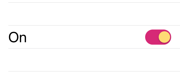
var text: String {
switch isToggleOn {
case true:
return "On"
case false:
return "Off"
}
}
}
...
}So when will this text should change?
It should change when the view sends an action through the store. Since it’s the only way the view can communicate with the reducer.
On the actions, create a new action called toggleSwitchTapped and on the view store binding you created before, on the send argument, call this action.
...
Toggle(
    isOn: viewStore.binding(
        get: \.isToggleOn,
        send: .view(.toggleSwitchTapped)
    ))
...
Finished! 🤩
Check my demo about this o my GitHub.
https://github.com/Sailor-Saturn/Switch-Toggle-TCA-SwiftUI/tree/main
Don’t forget to support my work through 👏 and follow. Have a great day.
References
- https://www.bigmountainstudio.com/community/public/posts/11825-swiftui-togglestyle-customizing-the-toggle
- https://developer.apple.com/documentation/swiftui/togglestyle
- https://betterprogramming.pub/custom-swiftui-toggle-styles-1b41959cf975
Thank you for taking the time to read this article.
If you enjoyed my work and want to stay updated on future projects, don't hesitate to connect with me on GitHub or LinkedIn. Thank you 🙏🏻